deviant art

Deviant Login Shop  Join deviantART for FREE Take the Tour
[x]
Shop Similar Prints
This Print Not Available
Download Image
JPG, 814×1047
more ▶

More from ~mikemayhew

Featured in Groups:

Details

June 5, 2009
373 KB
814×1047
Link
Thumb

Statistics

Comments: 47
Favourites: 481 [who?]

Views: 10,479 (3 today)
Downloads: 1,437 (0 today)
[x]
:iconmikemayhew:
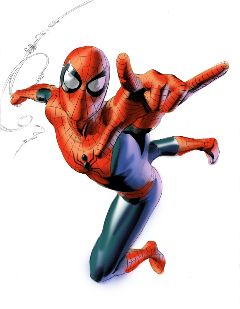
On 9X12 Bristol in pencil with ink wash. Color in photoshop.

Here's a test for Spidey. Gonna be doing some art with him, so I'd love to know what you all think of this.
Add a Comment:
 
:icontheartyst:
Your quick sketch certainly gives him the feeling of motion ( especially the out of bounds airbrushed coloring ) ... being only a test, I'm sure there will be much more going on in the final work - adding to the dynamism!

It also has that ol' classic Spider-Man look that I've come accustomed to after 30+ years drawing him myself countless times. I really like the way his body is twisting and reaching to change directions - without over-the-top contortions and exaggerations.

The only point I would change would be to have webbing starting to explode below his trigger fingers (it looks great without it, nevertheless ;) )

I really like the shape of the head, showing a slender jaw and neckline :spidey:


V渚õя
What do you think?
The Artist thought this was FAIR
27 out of 27 deviants thought this was fair.

:iconjohnbeatty:
I know this is just a sketch, but I'll note that the hand coming at the viewer is positioned poorly. It doesn't pop from the figure and gets lost in the other red and webbing of Spidey's suit. [It becomes a bit confusing in that whole hand-arm-shoulder-chest area.]

The back leg appears to be broken [and in an unnatural position] from the hip, like McFarlane did, he could get away with it being off because his drawing skills are not as strong as yours, and were based on his "own" rules. You have more traditional drawing skills, thus it sticks out to me more than it would on someone whose work is more stylized.

Last, I think the neck area is a bit overdone compared to the rest of the figure. Just my .02, for consideration.
What do you think?
The Artist thought this was FAIR
27 out of 39 deviants thought this was fair.

The Artist has requested Critique on this Artwork

Please sign up or login to post a critique.

love 2 2 joy 2 2 wow 1 1 mad 0 0 sad 0 0 fear 0 0 neutral 0 0
:iconnippoten:
~Nippoten Feb 13, 2012  Hobbyist Traditional Artist
Cool work!
Reply
:iconfelipefierro:
Mood: Love ~FelipeFierro Sep 25, 2011  Student Filmographer
LOVE IT!
Reply
:iconhour27:
Mood: Drooling ~Hour27 Mar 14, 2011  Student Digital Artist
Oh my god now I remember, I was at universal studios and I got my picture taken with spiderman!!!!!!! ^-^ he was so hot in that spandex!!! So sexy!!! :D
Reply
:iconmusou-enrai:
How should I say this? THIS! This is the type of cool foreshortened Spidey pics I'd like to draw but they don't turn out good enough/
Reply
:iconneilpalf:
~neilpalf Sep 3, 2010  Hobbyist Traditional Artist
BRILLIANT
Reply
:iconspydi-mel:
Mood: Joy ~Spydi-mel Sep 2, 2010  Hobbyist Traditional Artist
awesome:highfive: :superman:
Reply
:iconayelid:
I guess critiques for this are long past due, but what the hey. Makes me think I'm a big shot for a moment hehe ;).


This is an awesome preliminary drawing. The positioning of the head and the "trigger" hand look spot on to me, and I don't think a classic Spidey swinging through the air pose could be done any better. The foreshortening couldn't look better, either, and definitely shows your skills as a draftsman. The one thing about the left hand that looks inaccurate to me is the area between the index finger and the thumb. It's probably b/c of the foreshortening, but it makes the thumb look longer than the index finger. There is also an indented area near the bottom of his hand which makes it look as if his palm were resting way far off from where it should be. The right leg does look a little off somehow, especially near the calf. And I think the area between the muscles that rest on his left thigh and knee may look a little too long. I agree that the neck looks too "sunken in" compared to the way the form fitting spandex rests everywhere else on the figure. There's no reason to point out the color that goes outside the lines, as this is a test piece. Overall, it is a dynamic action pose that with a little cleaning up would easily be an instant classic cover image or suitable for merchandising.
Reply
:icondelusional11:
Wow amazing colour skill
Reply
:iconwatertownronin:
!WatertownRonin Sep 1, 2010  Student General Artist
This is a very interesting illustration.
Reply
Add a Comment: